Authority Branding Case Study:
Birdon
Maritime Ingenuity
Brand Strategy / Brand Positioning / Taglines / Logo Design / Brand Identity Design / Tone of Voice / Creative Direction
Local Hero to International
I watched it happen with Birdon Group.
Small brands evolve into global giants through deliberate steps. When Birdon approached me, their brand needed maturity to match its international growth. The last update? 2012. And the business had transformed a lot since then!
We started with listening (not design) through internal workshops. We peeled back the layers of their operations. Something fascinating emerged:
PROPEL - MAKE IT HAPPEN
and this became our north star.
The transformation required:
• Brand Strategy redesign
• Fresh positioning approach
• New visual identity
• Evolved tone of voice
• Complete creative direction shift
The results:
• Unified global presence
• Aligned maritime, environment and defense divisions
• A plan for seamless integration across Australia, USA & global operations
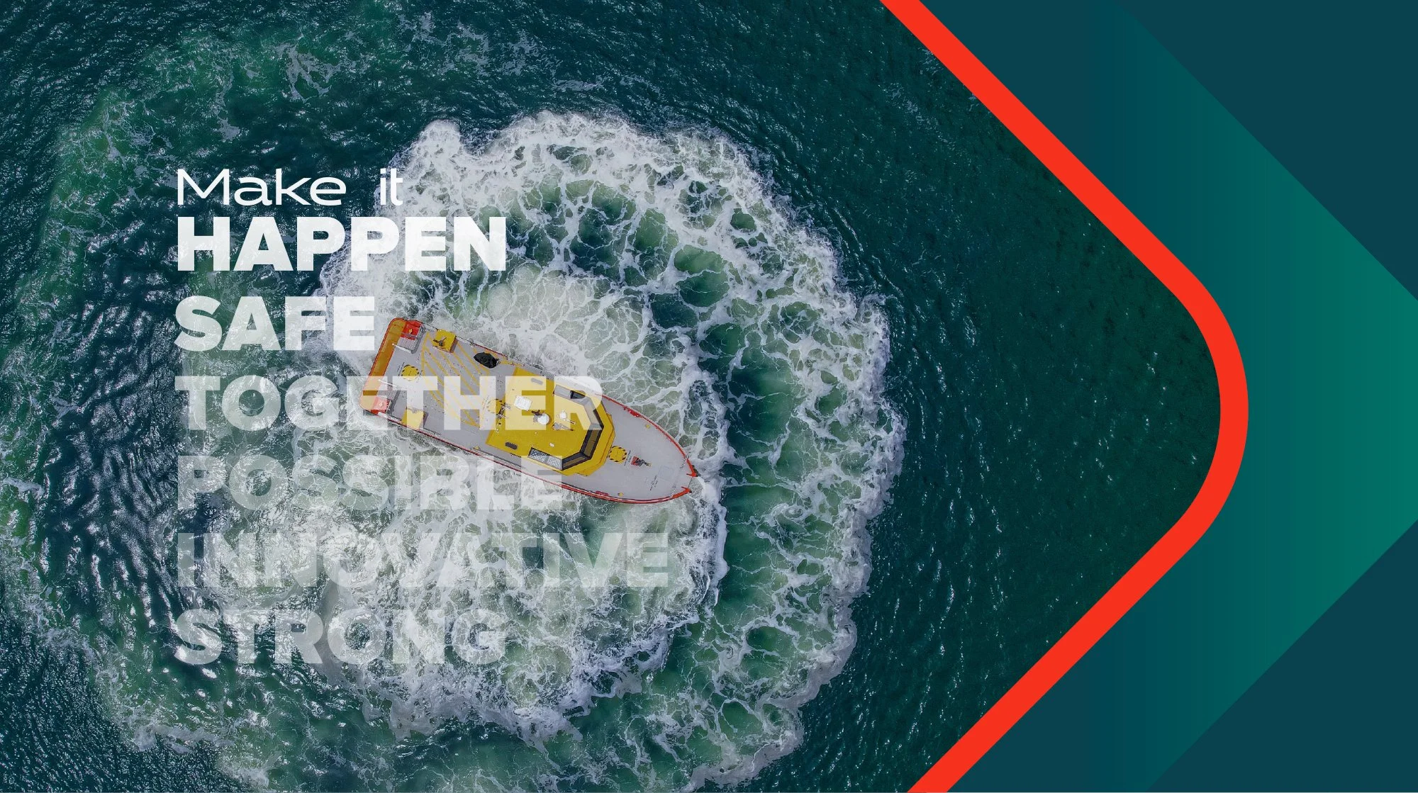
The brand transformation centered on their people's grit and tenacity. Like a propeller churning through water, it embodied constant forward momentum.
Every element reflected this:
• Dynamic animations
• Forward-moving design elements
• Circular rotation motifs
• Momentum-based visuals
Growth demands evolution.
Brands must mature alongside their business expansion.
“Jason was able to take our internal and external research and translate this into a new visual direction for us. The video that Jason produced to help introduce the new brand direction to the world was fantastic.”
Jane Hillsdon - Chief Marketing Officer for Birdon
The brand has been recrafted through this lens of their people’s grit and tenacity, a propulsion of growth and ingenuity.
“Propel” is the creative idea that unifies the brand, symbolising growth and forward momentum. To propel is to drive or push something forward. To propel is to bring momentum and movement. Propulsion is dynamic.
Like a propeller churning through water, it embodies the constant drive to move ahead. This concept translates seamlessly into creative elements, with animations featuring arrows and subtle circular rotations, reflecting the motion and energy of propulsion.
Below is a visual overview of the branding process and concepts
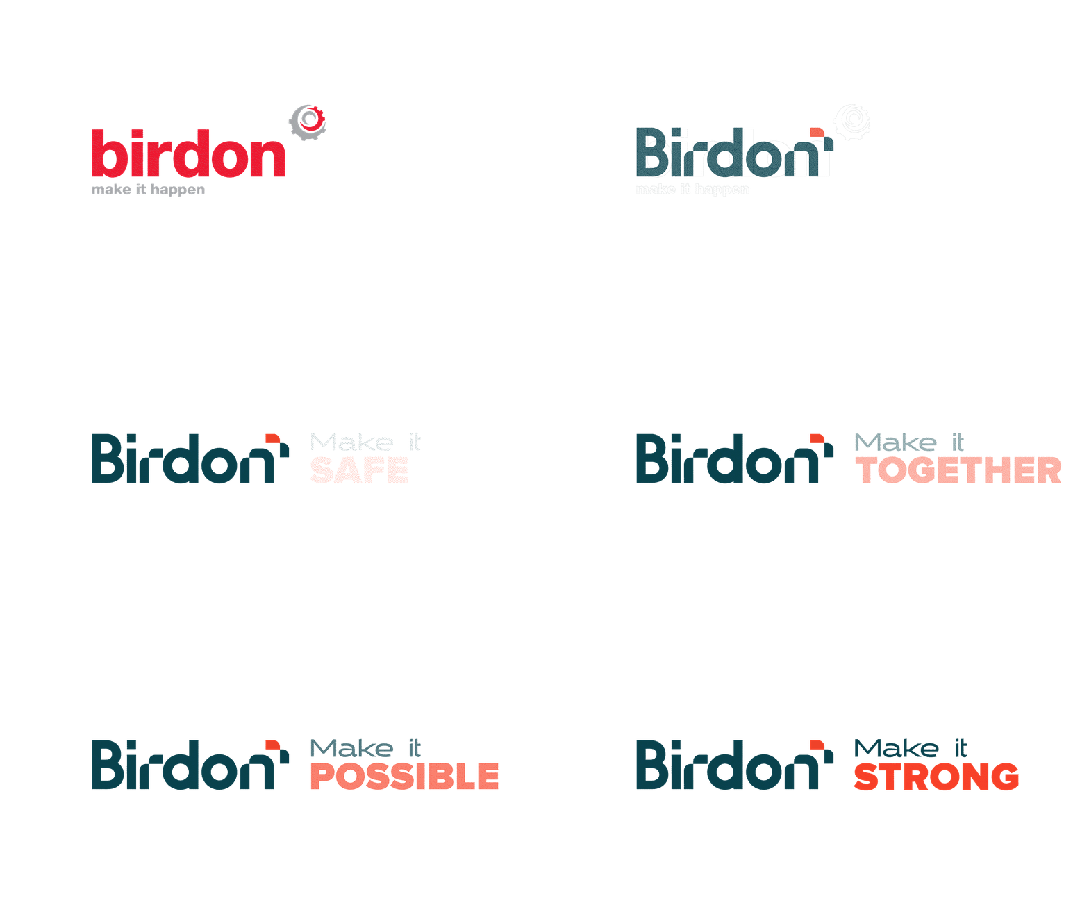
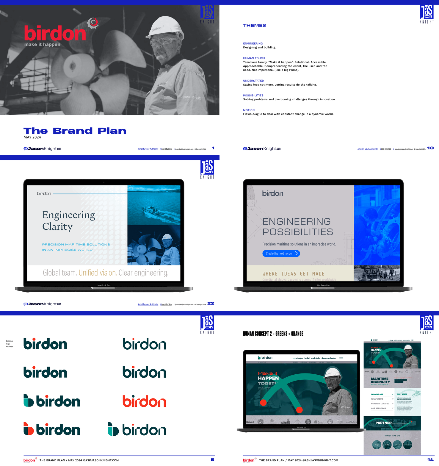
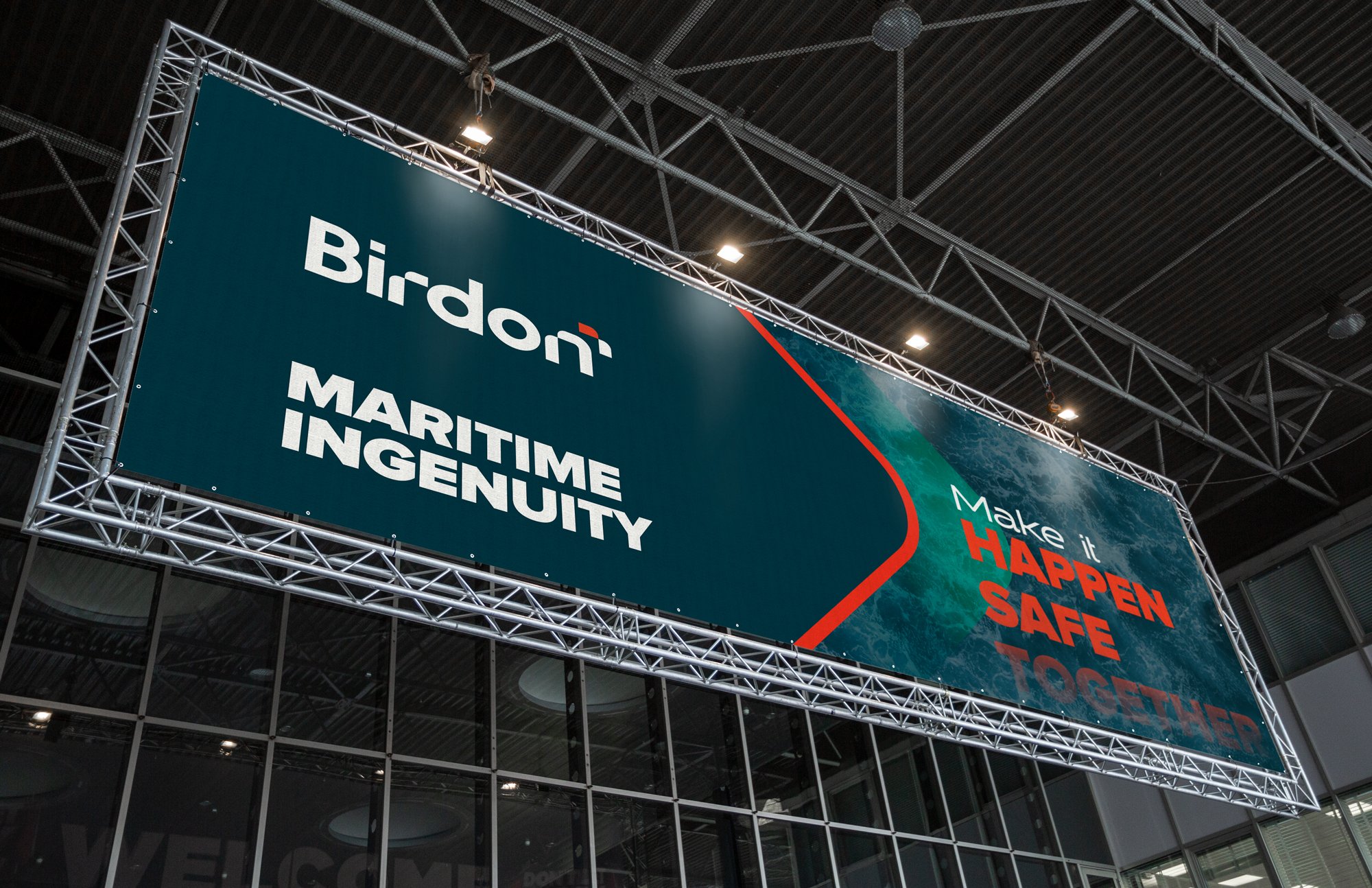
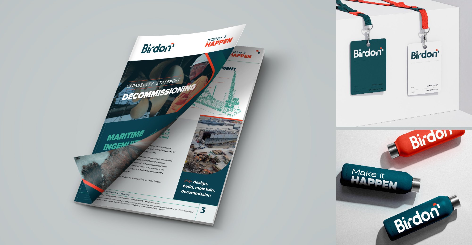
The result of the brand refresh

