Authority Branding Case Study:
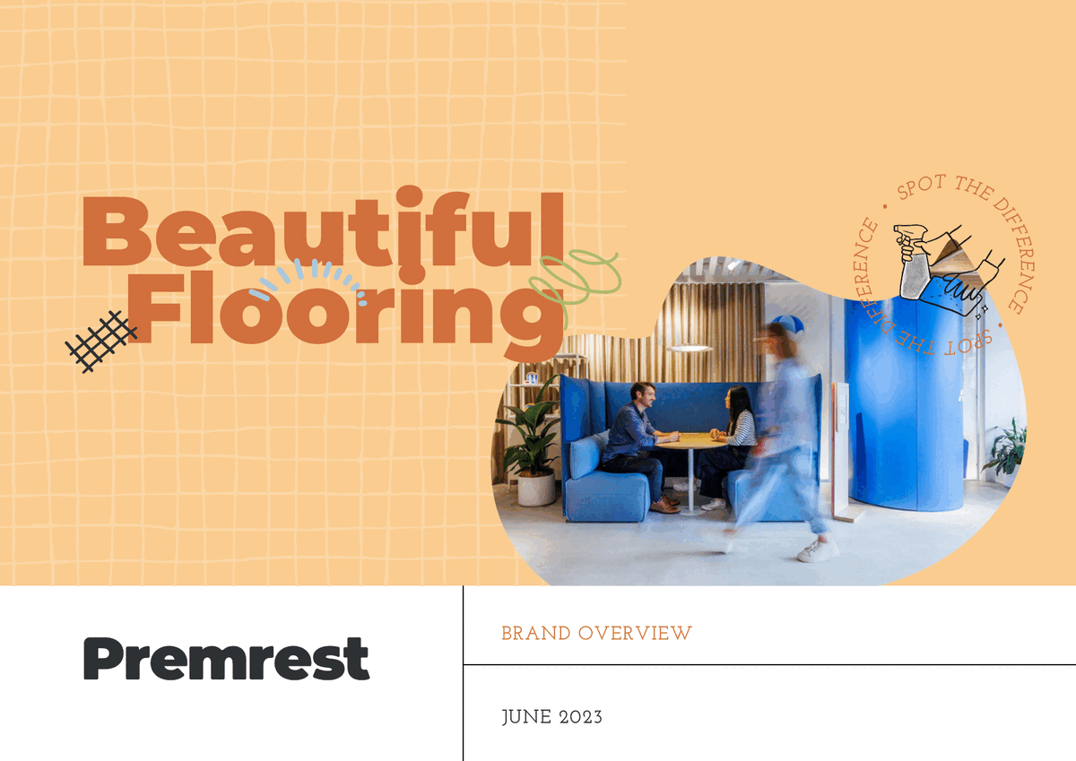
Premrest
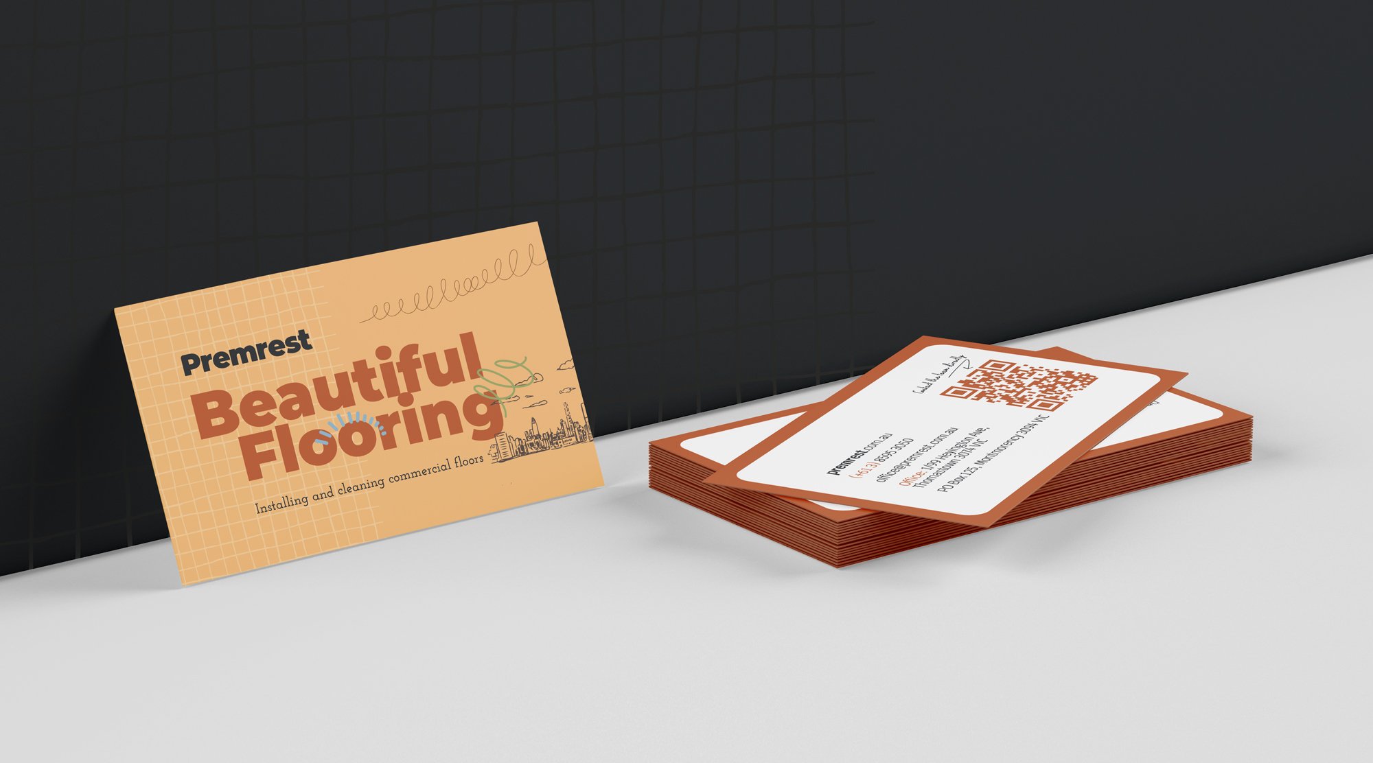
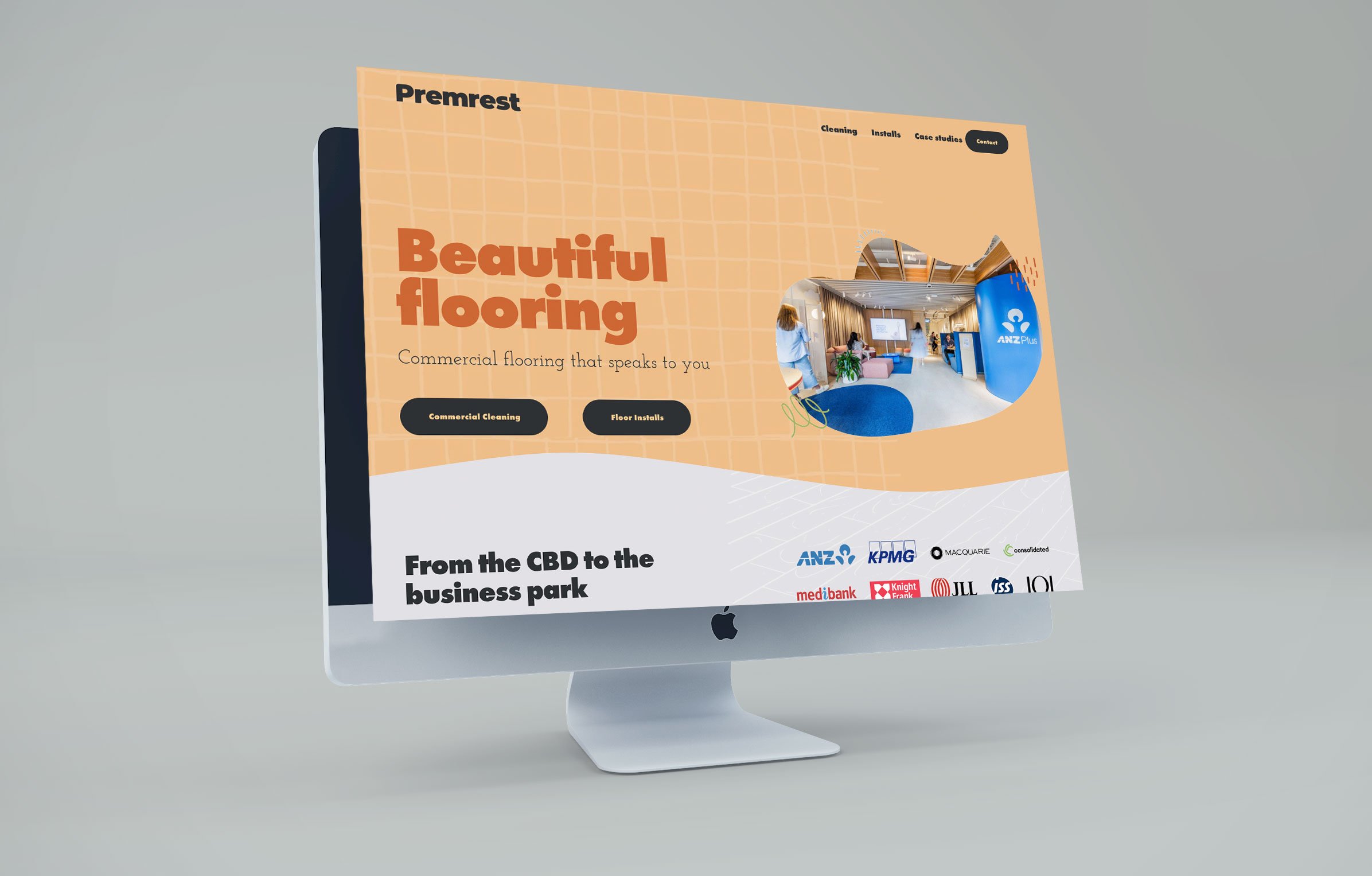
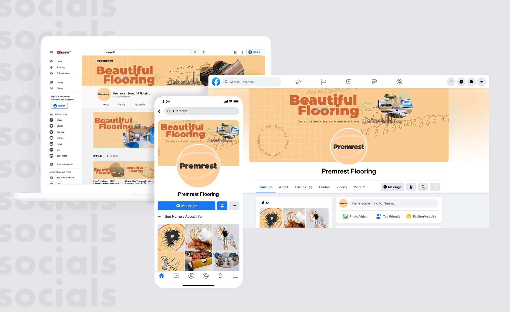
Rebrand / Brand Identity / Website / Video / Socials / Signage
Premrest was struggling with confusion in both its messaging and visual identity.
The brand’s communication separated its services, leaving potential clients unclear about what it actually offered. The lack of visual appeal compounded this issue, making it difficult for Premrest to stand out in a competitive marketplace.
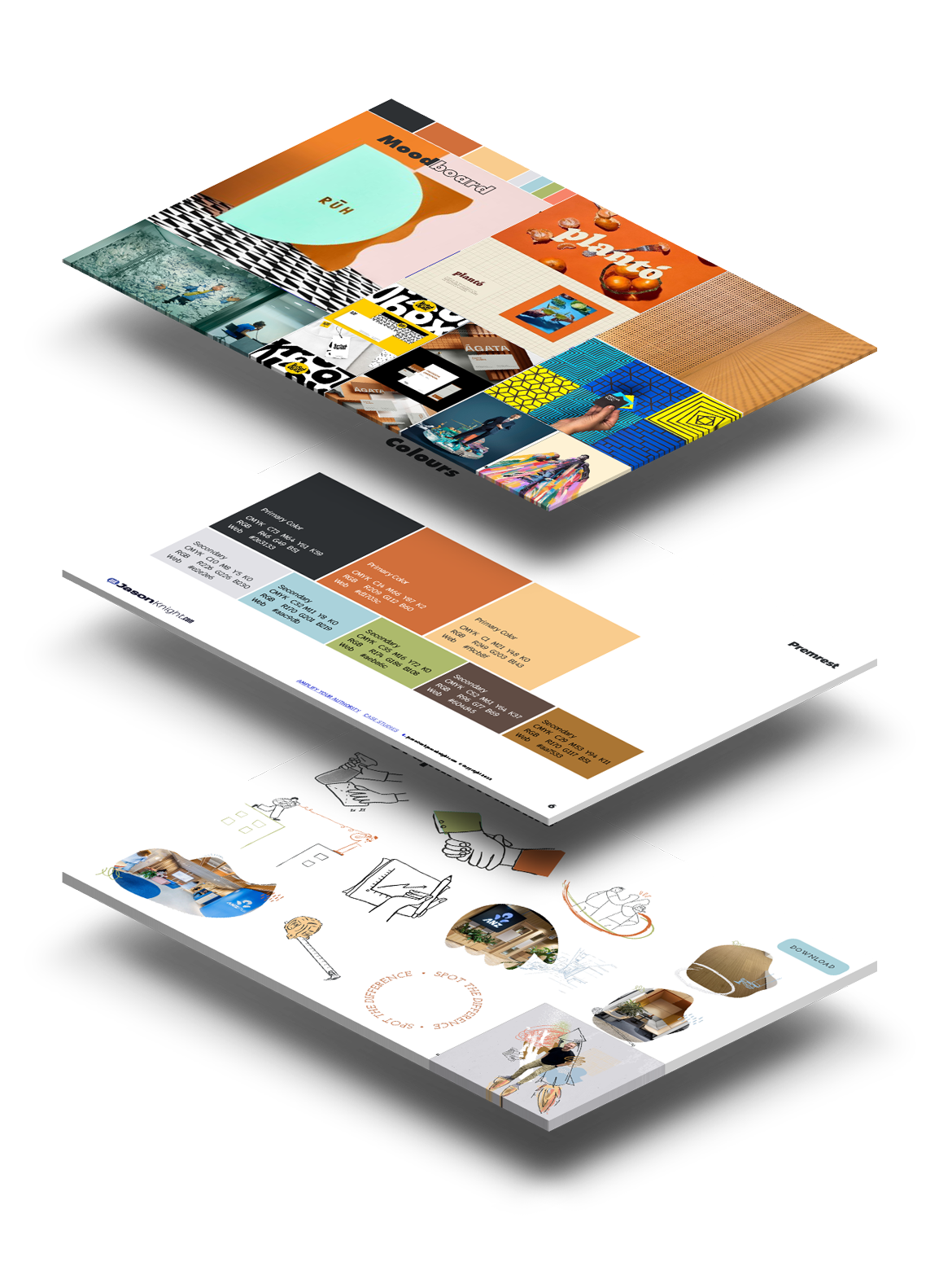
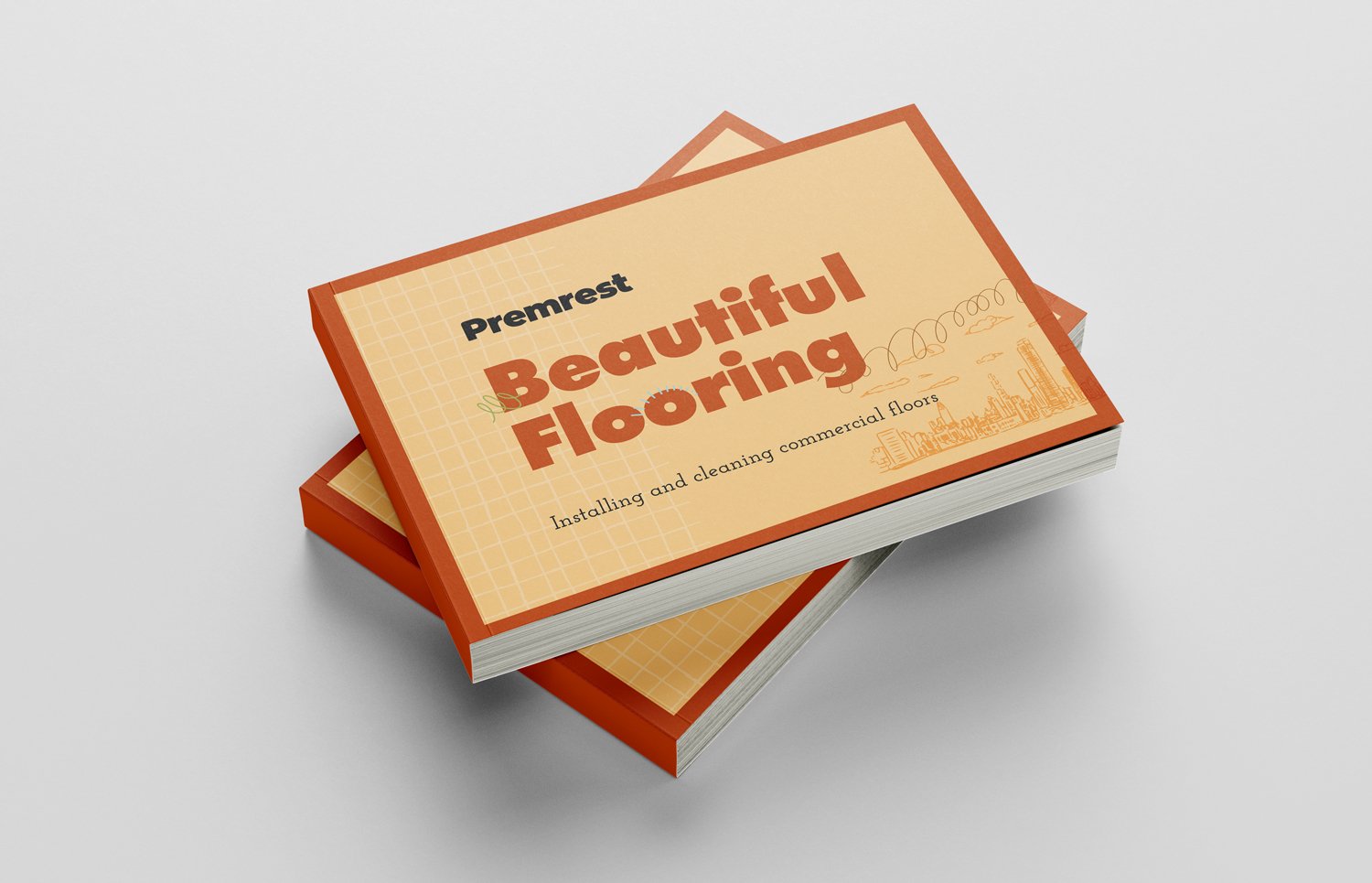
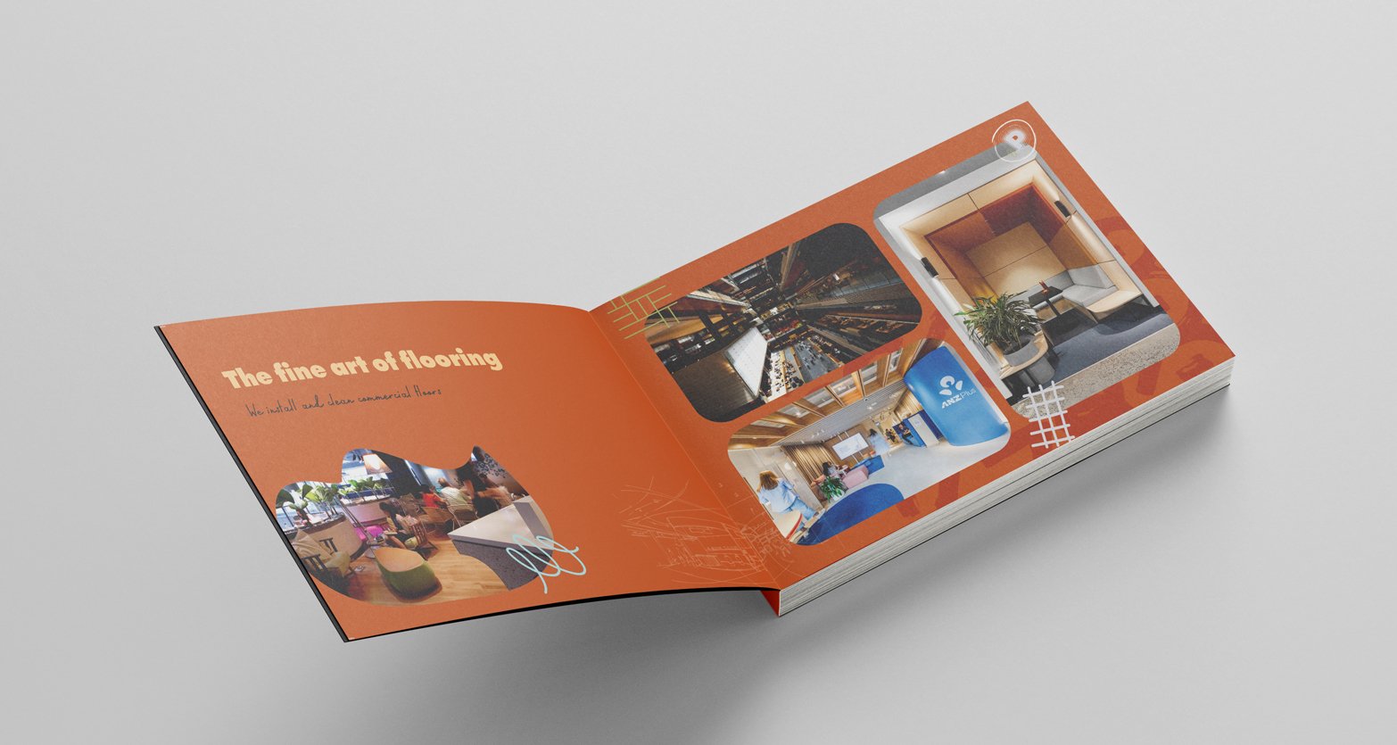
We uncovered a significant gap in the market for a flooring expert with a strong personality. We repositioned Premrest as a high-end flooring expert, showcasing their deep knowledge without explicitly stating it, while infusing the brand with the fun and approachable personality that matches the team.
The result was a clear, unified brand identity that resonated with their target audience.
A new tagline tied the two services together, eliminating the previous separation. By addressing client pain points directly and utilising the Sage and Jester archetypes, we added a touch of playfulness to their expert knowledge, ensuring the brand was approachable yet authoritative.
The results were immediate: within just a month of launching the rebrand. As Ben Young from Premrest said, “We've picked up 2 new decent-sized clients just from the LinkedIn content and the rebrand!"


Ben Young
“The process, working with Jason, was very smooth. The main value we got out of it was Jason's ability to boil down exactly what it is that we do and clearly put that into a message that makes sense.
As a brand we were confused, and it was confusing to our potential clients exactly what we did.
We basically just had Jason evaluate the whole thing. And he really understood, what the messaging should be for the business.
I loved having the feedback loop of weekly calls where he would show us pages of ideas. Having the ability to say, I like that - I don't like that - was really helpful. I feel we got to where we got to alot quicker rather than waiting for a polished idea.”

